Friday, June 26, 2015

Ruby Rock-it Sponsor Dare

Good morning everyone!  
We are excited today to introduce the first of two sponsored Ruby Rock-It dares!


Here is a little about Ruby Rock-it :
Ruby Rock-it Designs was created by Fynmark in Australia in 2008. Already successful with other mainstream papercraft brands in the local market Creative Director Joanna wanted to create a new brand that focused on all the things she loved – vintage style papers and richly textured embellishments – and so Ruby Rock-it was born. “It’s an acknowledgement to my grandmothers who were a huge influence in my life growing up – their tea-cup patterns, their love of all things olde-worlde.”
There are just oodles of wonderful products for all types of crafters so why not take a peek at their {website} or follow them on their {facebook page}

So here is this week's dare!
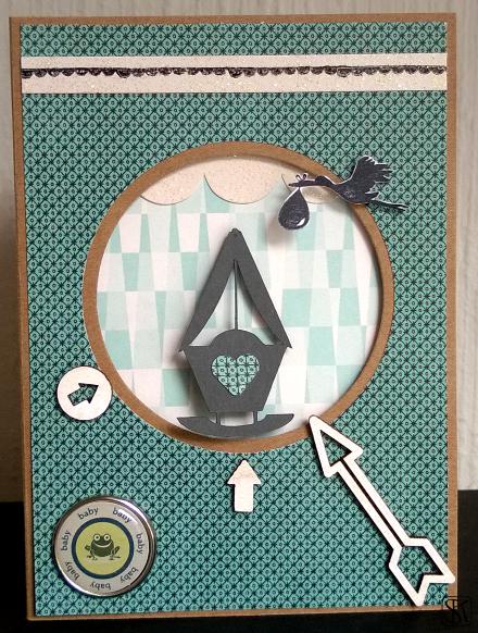
*****
Baby Rock-It!!
The products the DT are using are from the Fundamental range from Ruby Rock-it 

The dare is to make a Baby themed card which has a 'rocking' or 'moving' element to it!

*****

We have this wonderful little prize back from RRBF for one lucky person who completes the dare this week (Winner will be drawn randomly just after next week's dare is revealed):


Here is some fab inspiration from the DT:

Beckie


Lythan

Kathy  

~~~~~~~~~~~~~~~~~~~~~~~~~~~

Friday, June 19, 2015

Yes, it's supposed to be blurry ...


Hello lovely blog readers and fellow crafters,
Thank you for sharing your bright creations with us.
It’s Friday again and here’s our new challenge.

A few weeks ago I, Miri,  stumbled across the bokeh technique and I think it makes perfect hand made backgrounds or focal points on cards.

In photography, bokeh (Originally /ˈboÊŠkÉ›/,[1] /ˈboÊŠkeɪ/ BOH-kay — also sometimes pronounced as /ˈboÊŠkÉ™/ BOH-kÉ™,[2] Japanese: [boke]) is the aesthetic quality of the blur produced in the out-of-focus parts of an image produced by a lens. […]Bokeh is often most visible around small background highlights, such as specular reflections and light sources, which is why it is often associated with such areas.[7] However, bokeh is not limited to highlights; blur occurs in all out-of-focus regions of the image.(source)

After watching a few tutorials I gave it a try and found out that the bokeh technique is much easier as it looks like and the results are great … even at the first try. And all you need is a white inkpad or white acrylic paint or bleach (or even a light coloured ink pad such as a very light blue).

I dare you to use the bokeh technique on your cards!

Be inspired by the creative ways the Design Team members came up with or watch some online tutorials.

This tutorial is quite easy and you only need a few coloured ink pads. 
For the tutorial here and here you need coloured ink pads AND a white ink pad.
The crafty lady in this tutorial uses water colours and a white ink pad. But as you can see in the videos above you can easily create the background with ink pads too.

We would love to inspire you to try out something new and see your blurry creations!


 Miri

Dawn

 Lythan

 Sharon

Kathy


~~~~~~~~~~~~~~~~
InLinkz

Friday, June 12, 2015

Glowing Neons

Thank you all for joining Leo's beautiful June Elemental Inspiration challenge. 
It's Zuzana here this time with new dare for you. 
As the summer approaches us with sunny weather we have a tendency to pick more bright colours from our closet to wear. 
So I'm asking you to turn your brights on and use

GLOWING NEONS
  
on your cards! Neon blue, green, magenta, orange, pink violet or yellow!

Here is some help from our design team to inspire you. 

Kathy   


Svenja  

Miri  


~~~~~~~~~~~~~~~~~~~~~~~~~~~~~~~~~~~~~
InLinkz


Friday, June 05, 2015

Elemental Inspiration for June

Hi everyone and anyone, Leo here this week to bring you the June Elemental Inspiration. First off thank you if you joined in with last weeks 'Mirror Mirror' dare, I found that mirror stamping was really fun to have a go at so if you've not tried that one out for be sure to check it out :)

This week as with every first week of a new month we have an image and you have to pick out a minimum of three elements to design your card with.
 These elements could be anything at all but each can only be one thing, for example the colour can only be one - you can't separate them into individual colours. The layout of the image may be another and Kathy has drawn up a sketch for us from the image so you can use that too. I've added the sketch underneath the image:


Layout Sketch:
There's lots and lots in the image to pick out. I particularly like the paint marks and the doodles in the background which I can see as stamped images over watercolour marks. The inky numbers could be picked out for a birthday card design too and the lotus flowers would also make a pretty individual element. There's so much here I bet you can use more than three too!

Here's what the design team have come up with this week, have fun!
x Leo

Mark making : long hair : colours : paint : line drawing

Image of girl and long hair : Flowers : Pink Spots : Numbers

Image of girl : Dots : Stripes

Colours : Flowers : Layout sketch
Colours : Old Paper : Painting : Line drawings
Layout, Colours, Paint splodges, Hair, Flowers, Tape and Ribbon


image of girl, unfinished drawing style, flower, goldfish


Pencil Drawings, watercolour, colours, flowers and dots

~~~~~~~~~~~~~~~~~~~~~~~~~~~~~~~~~~~
InLinkz: